Your year in news... a year in the making
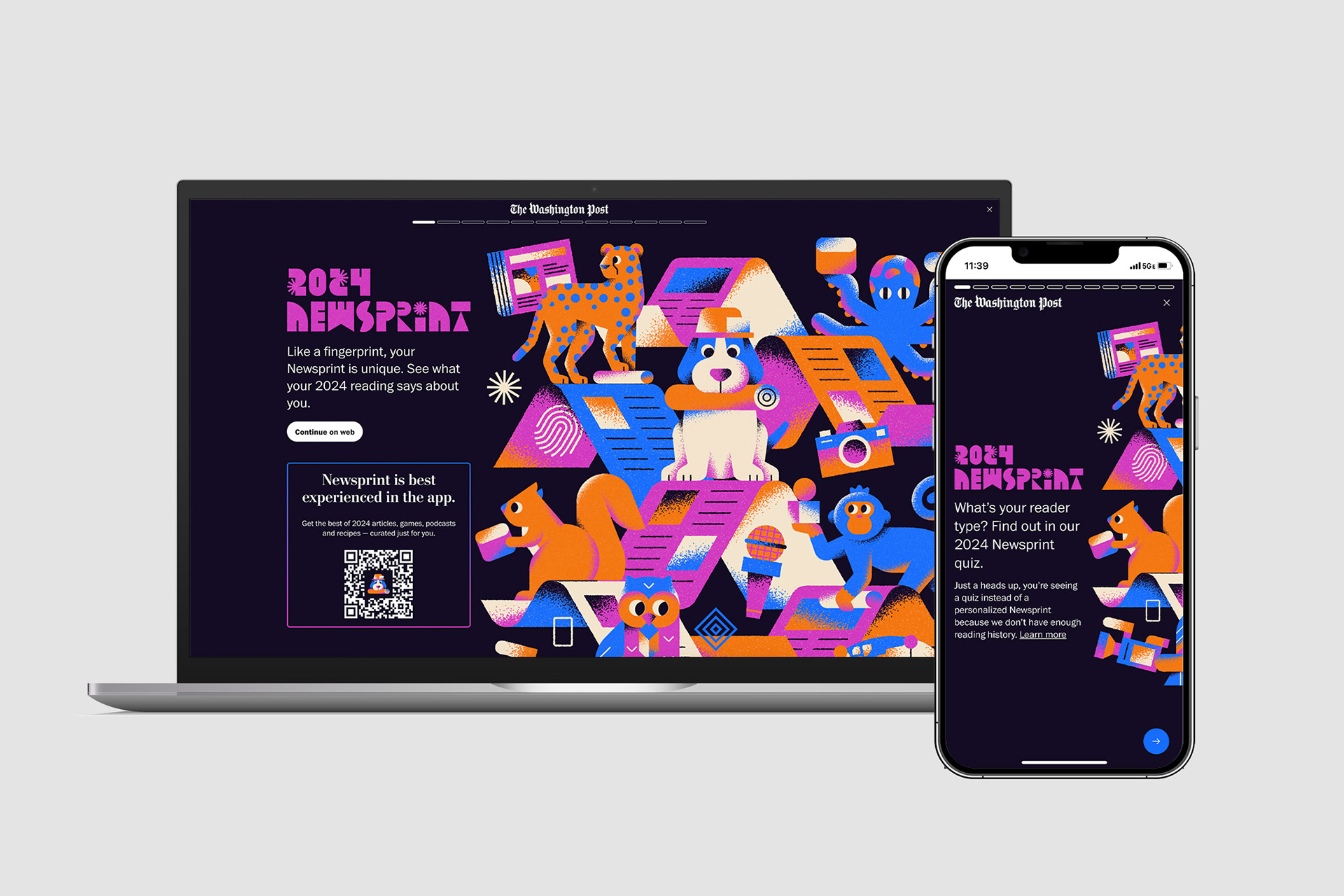
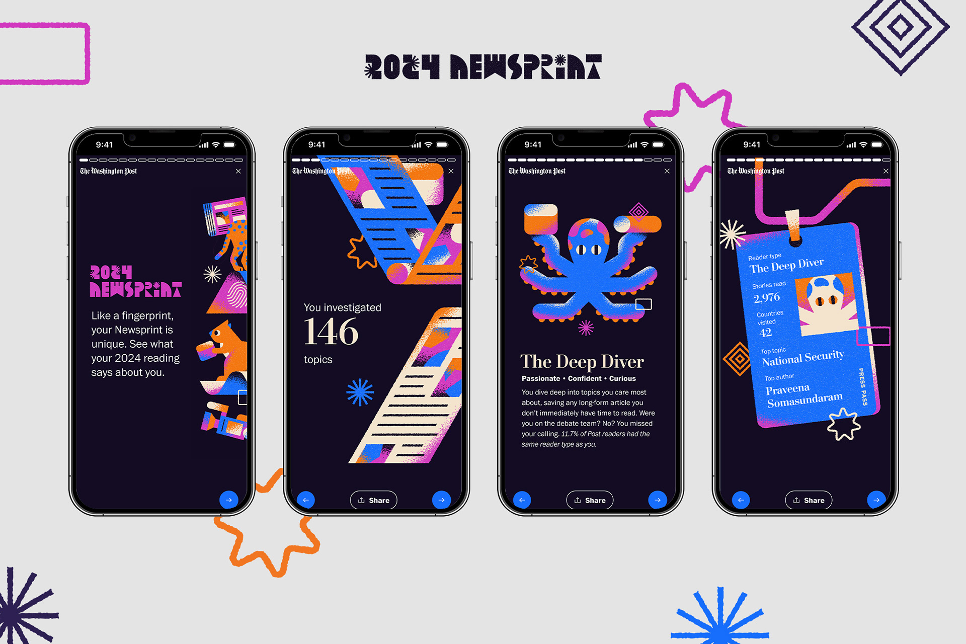
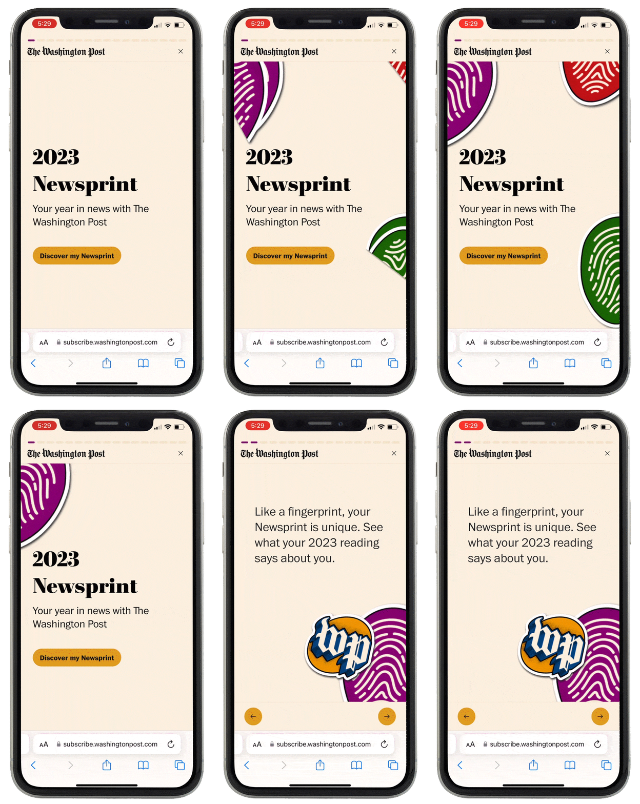
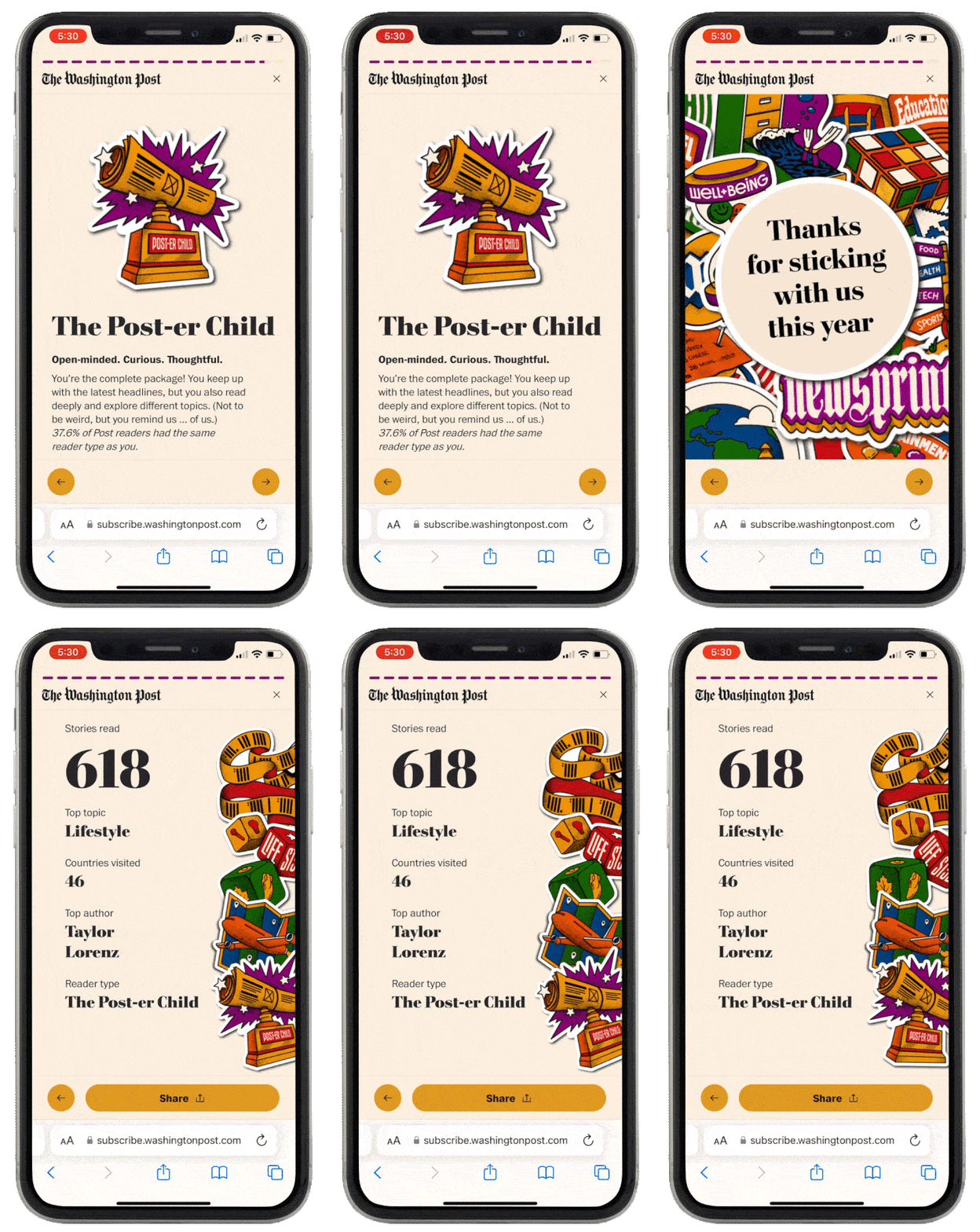
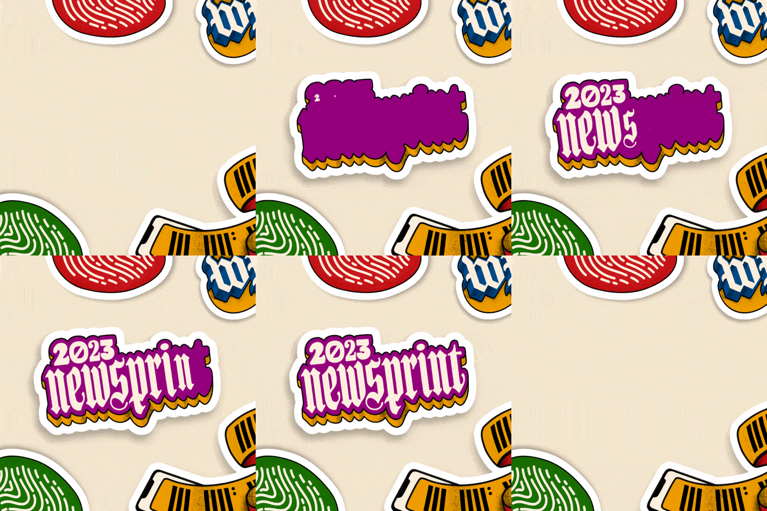
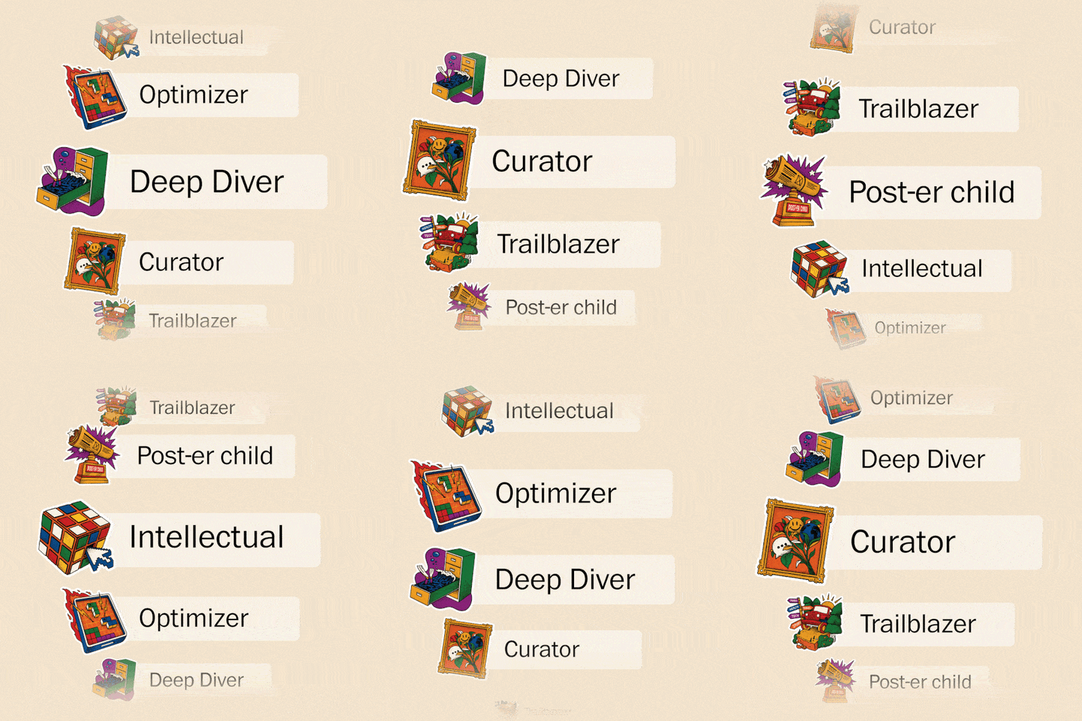
Since its inception in 2022, I've been a front-end designer and art director for Newsprint, the Washington Post's year-end review product. From the beginning, I've wanted the experience to be vibrant and sleek while still looking quintessentially Washington Post. This year, I commissioned artwork from Ray Dak Lam and animated the assets using Lottie to translate this style across all of our platforms.

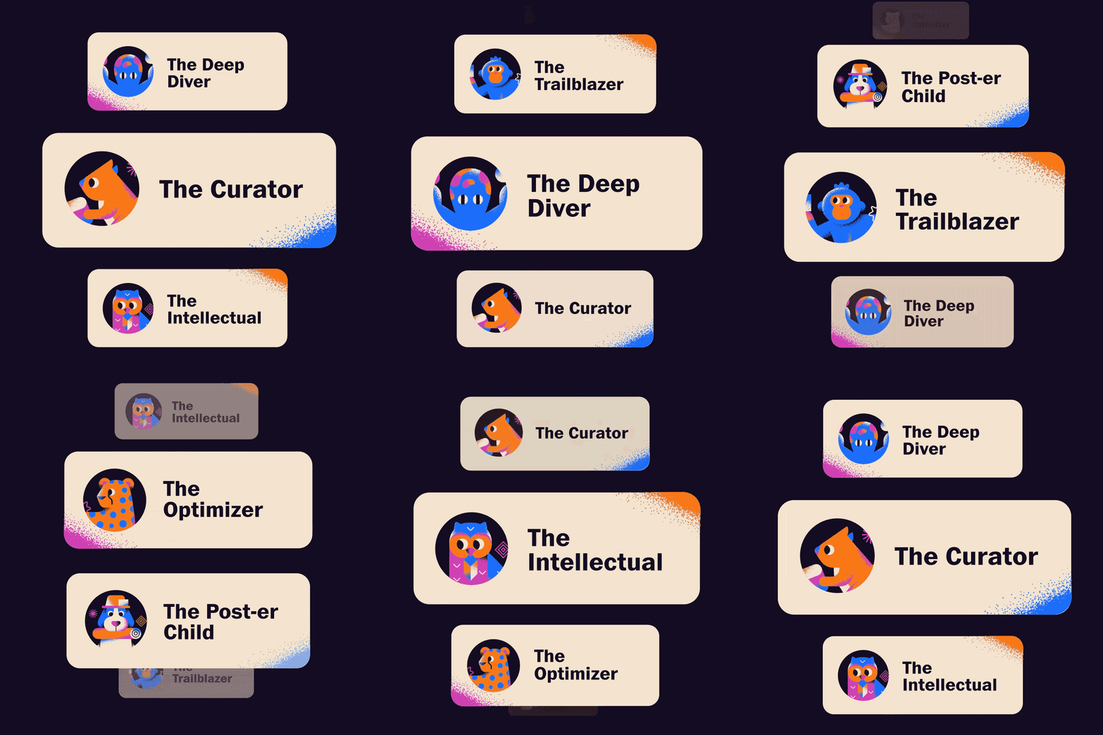

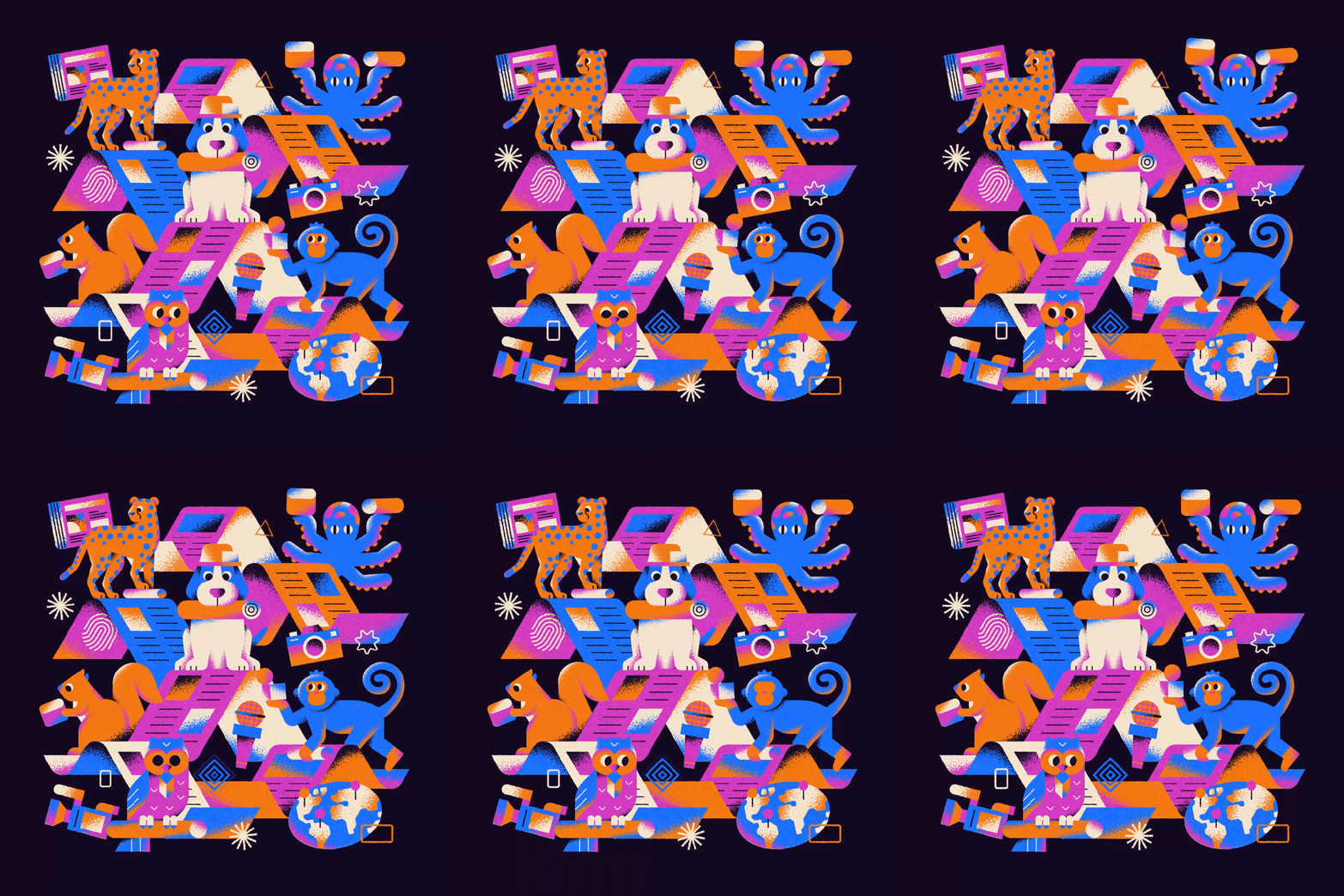
On the design side, creating Newsprint is a two-part effort: we spend the first half of the year brainstorming design styles, commissioning the art, and creating the visual identity. Then, in the second half of the year, we pivot to making marketing materials and find ways to showcase the product on as many surfaces as possible.
Ever-evolving design
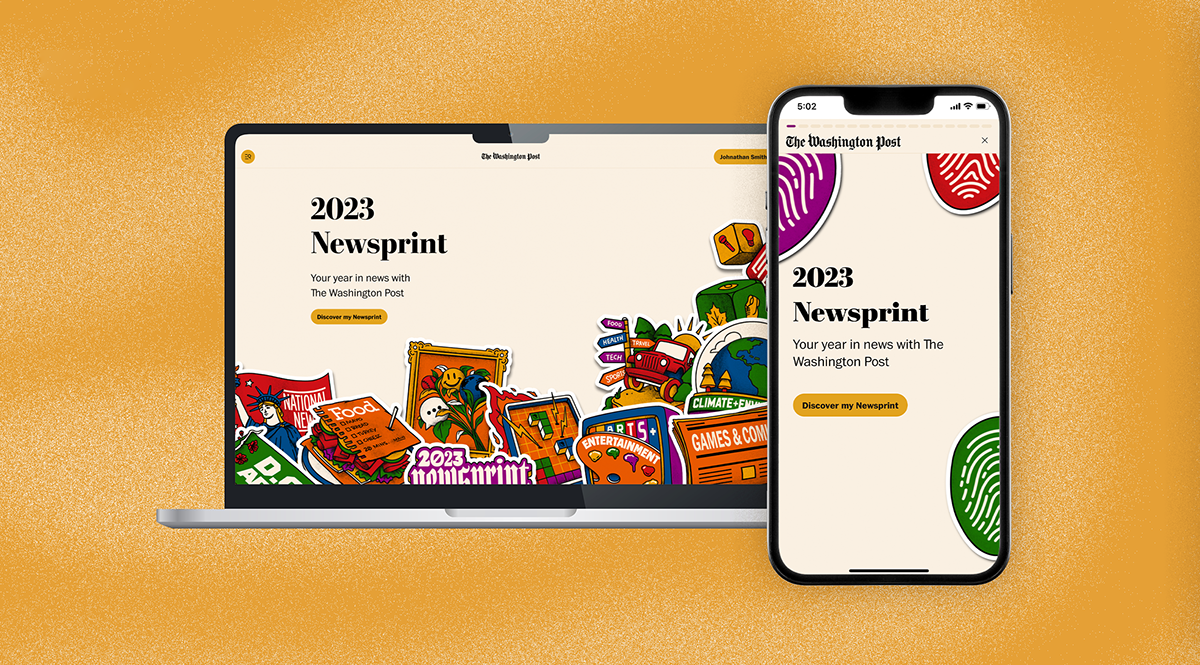
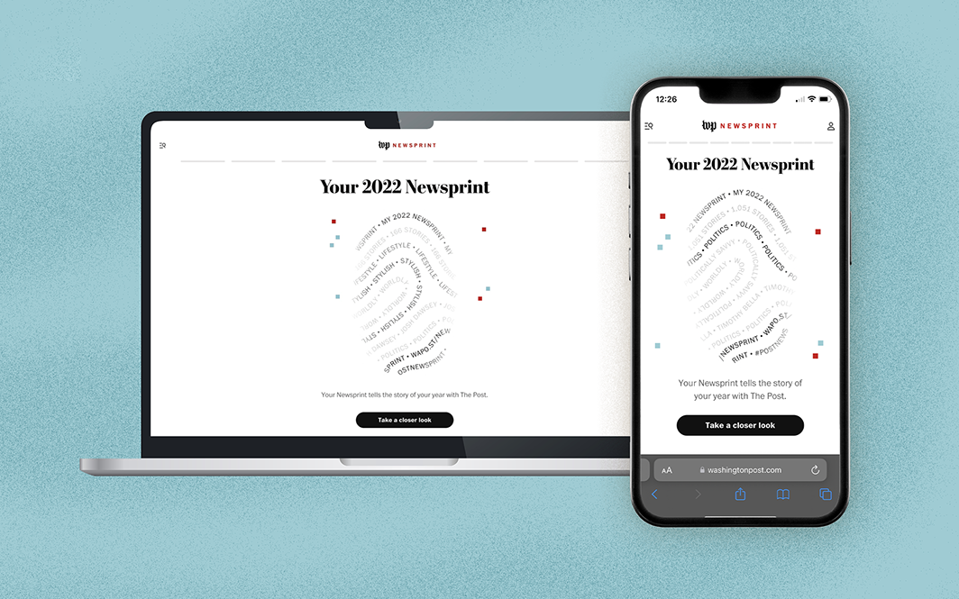
This was the third year we produced Newsprint. Each year, we make the experience feel fresh and exciting by working with a new artist and color palette. Keep scrolling to see highlights from last year's experience.
From beginning to end
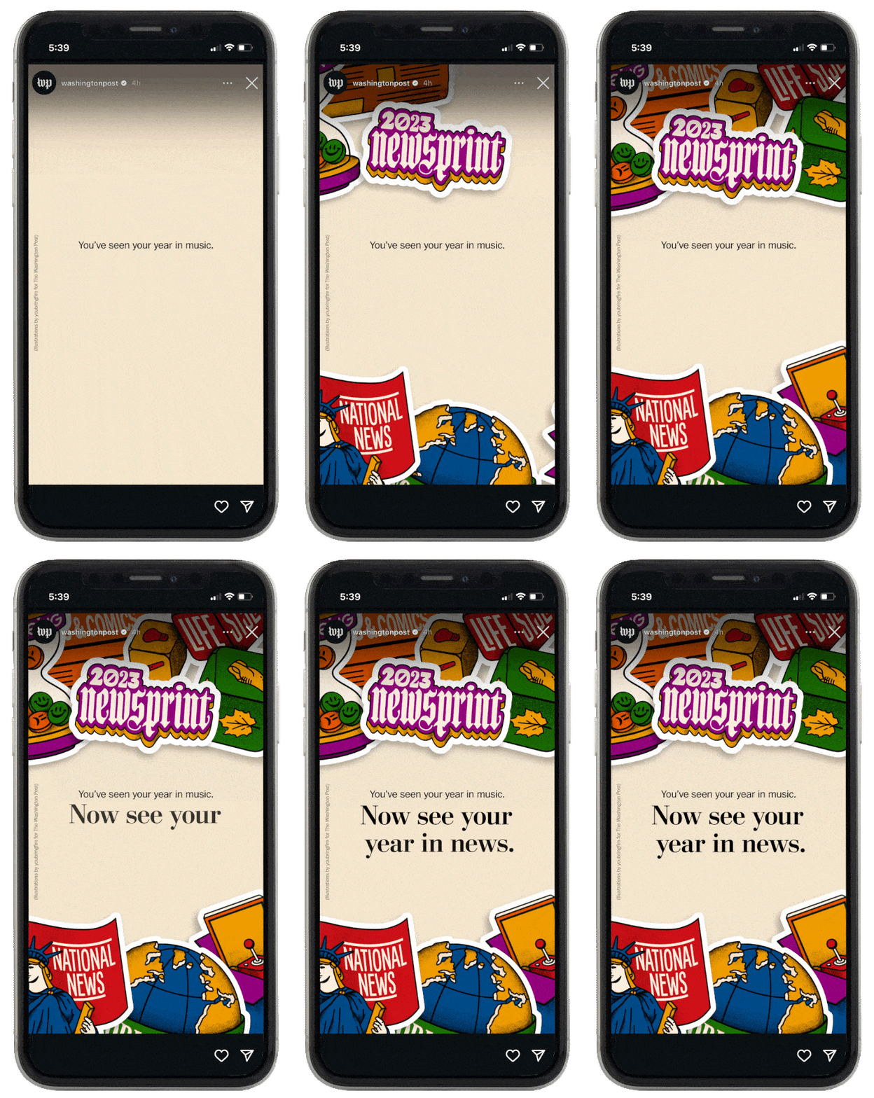
Designing Newsprint doesn't just mean mocking up the layout — it also means brainstorming what kind of statistics readers would want to see, what new features might feel unique to the experience, and what role The Post should play in the hectic year-end wrap-up market. And once it's done, I also get the opportunity to imagine how to promote the product across our social media feeds, especially Instagram Reels and Stories.
Making Headlines
We were the first newsroom to create a product of this type, which was recognized in The World Association of News Publishers, What's New In News, Neiman Labs, and Editor & Publisher. You can read The Post's product announcement here. In 2023, Newsprint won Awards at SND, SPD, and was awarded second place in WAN-IFRA. In 2024, it was nominated for a Webby (getting second place only to Strava) and won awards at SND and SPD.
Spotify Wrapped Redesign
A winter break passion project
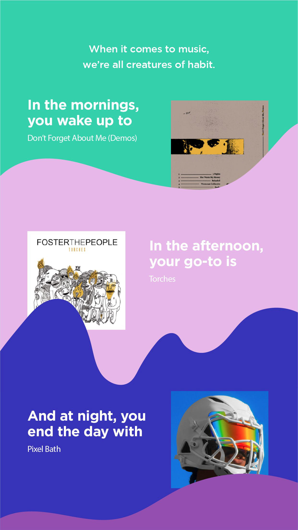
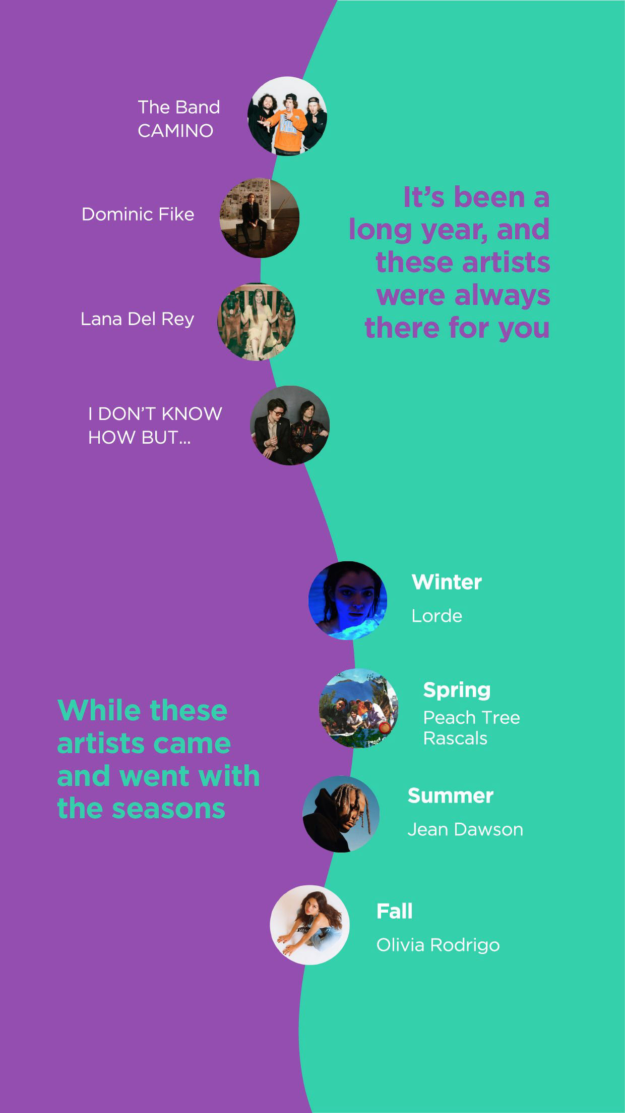
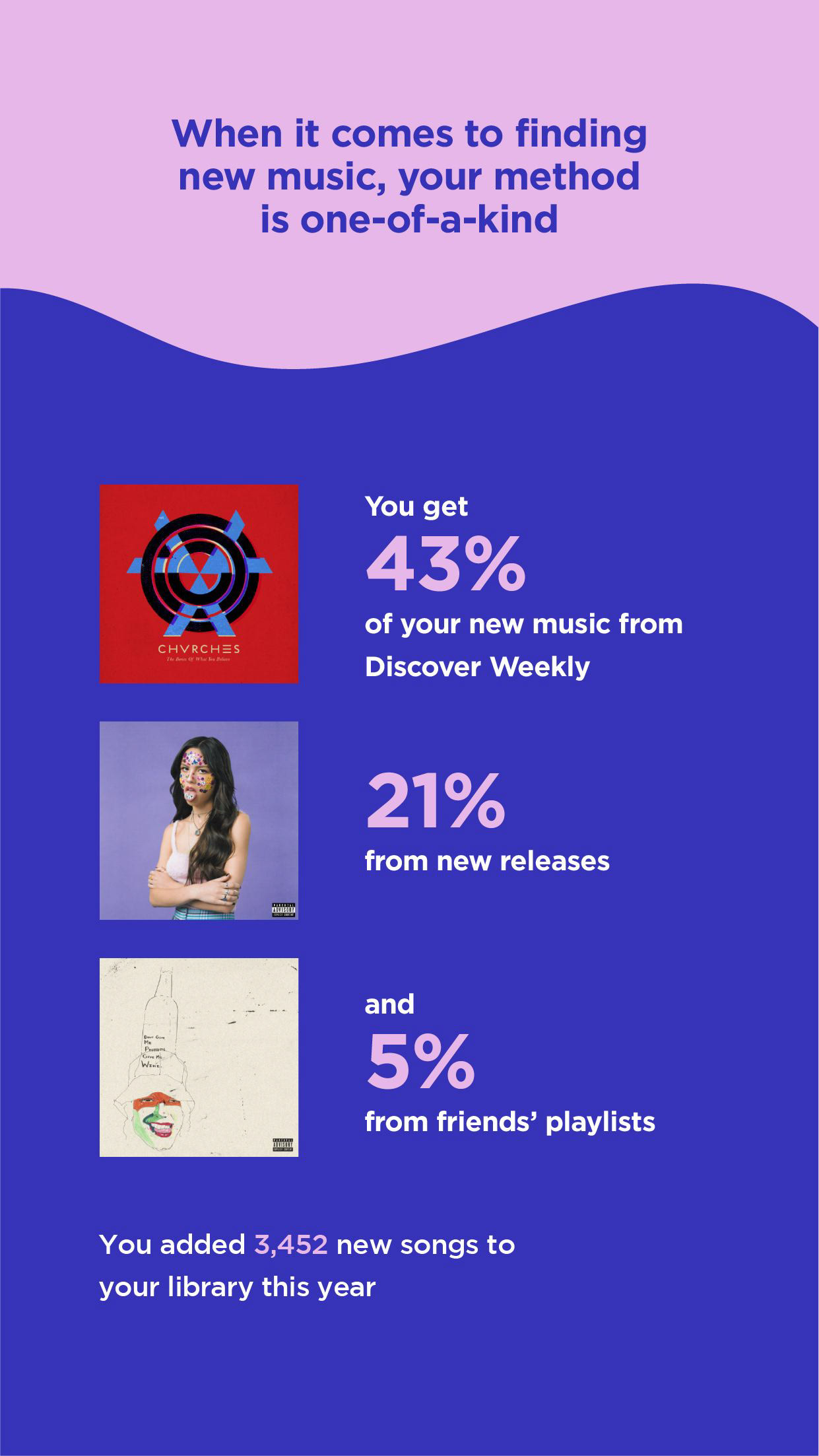
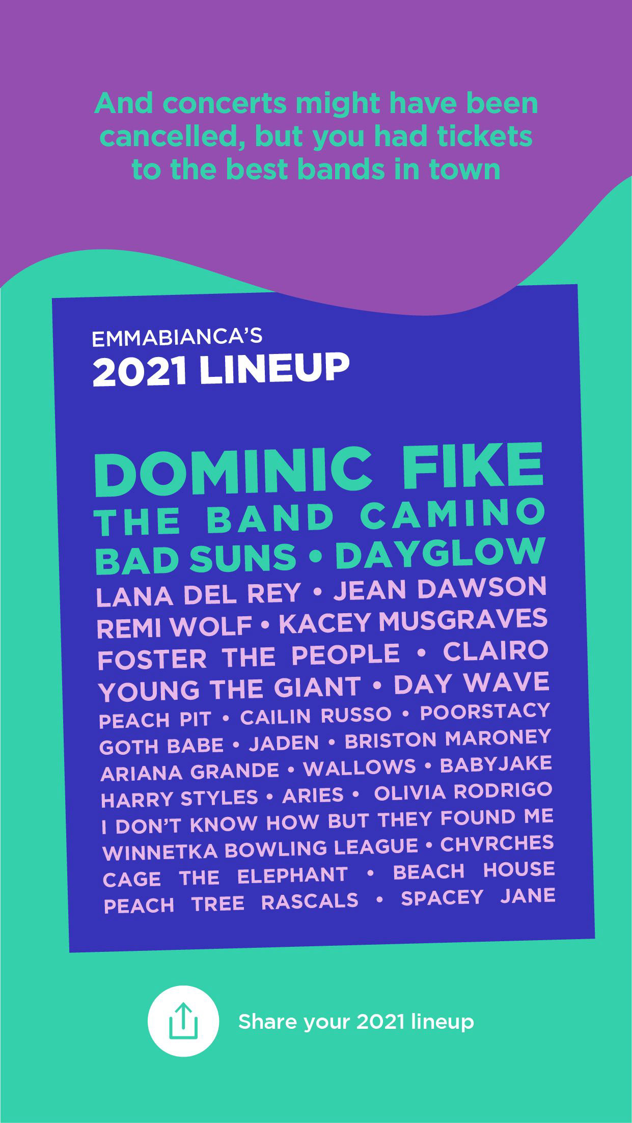
I look forward to the drop of Spotify Wrapped every year for the same reasons as everyone else: I love music, I love having an opinion on it, and I love sharing that opinion in a well-packaged graphic. In 2021, I spent my winter break designing a proposed extension of the product with four fake data points — none of which existed at the time.
Real-World Implementations
I posted my original redesign on LinkedIn. Within months, I had over 2 million views, 26,000 reactions, and even comments and reactions from Spotify themselves.
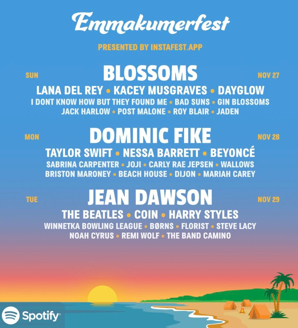
When Spotify Wrapped dropped in 2022, I saw that Spotify had incorporated the "time of day" data point. In 2023, they also included "season" metrics. Between these releases, an app named Instafest, designed by Anshay Saboo, went viral for creating a concert lineup generator. I have no way of knowing if any of these works were inspired by mine, but it was pretty cool to see three out of four of my ideas come to life!
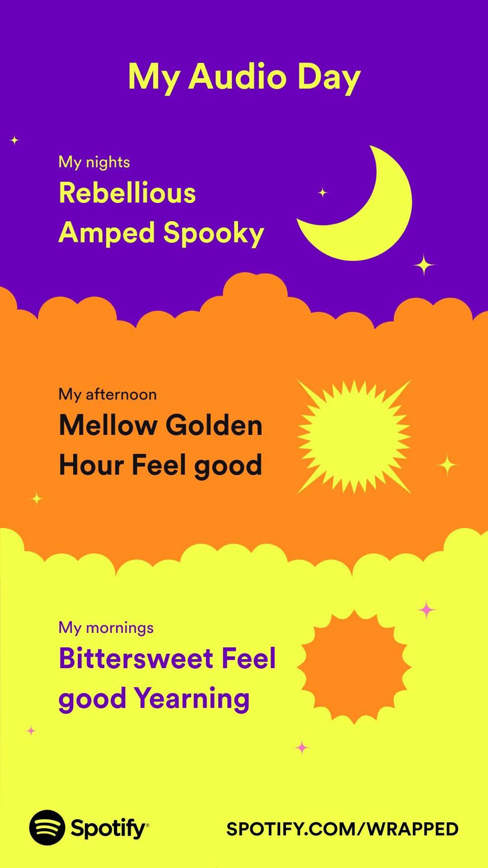
Spotify Wrapped, December 2022

Spotify Wrapped, December 2023
