North by Northwestern is a college magazine and website created for and by undergraduates at Northwestern University. Every year, it publishes three 64-page magazines alongside its online content. I was a designer/creative director on the magazine staff for three years and worked as the Print Managing Editor (essentially the Editor-in-Chief, but with a print-specific title) the spring of my junior year.
To the left (or above, on mobile) are all of the covers I designed for NBN.
Fraternity Feature
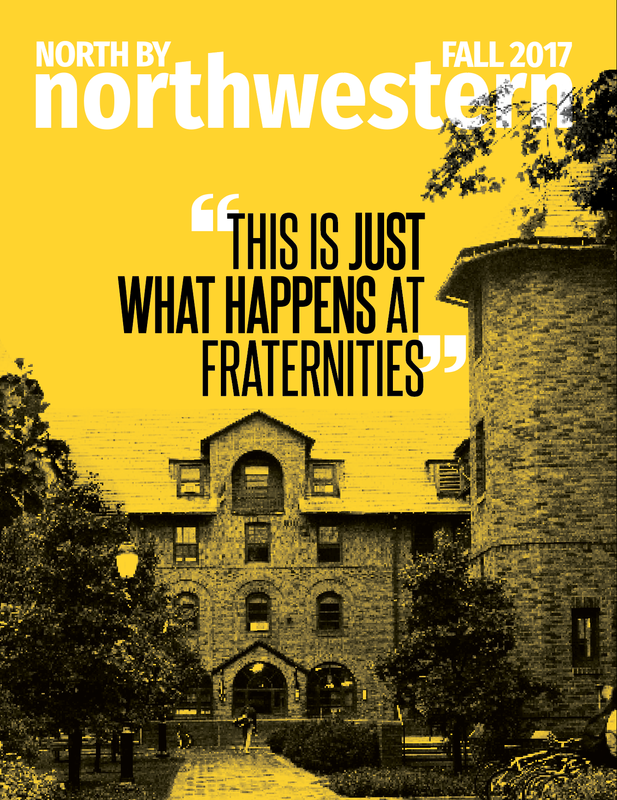
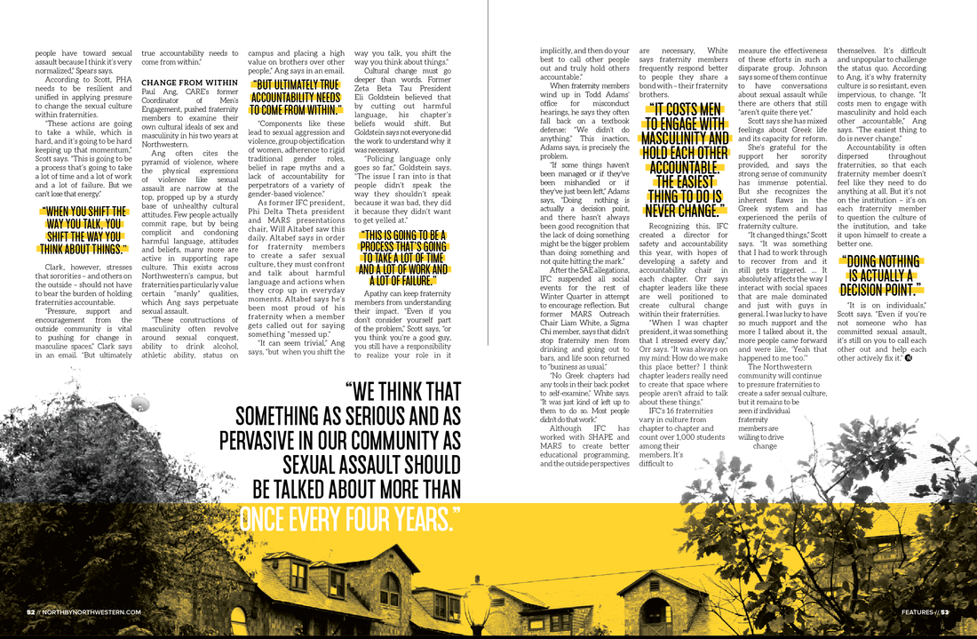
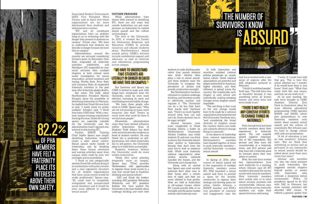
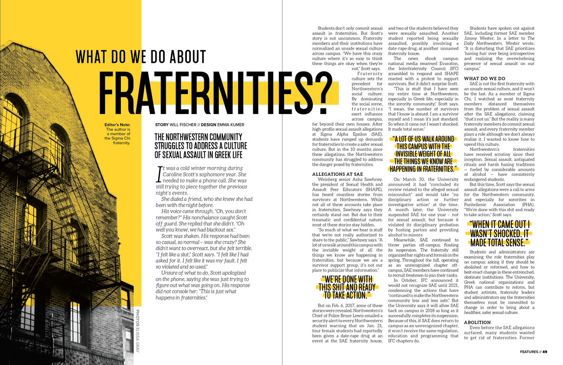
After a series of sexual assault incidents on Northwestern's campus, our campus magazine tackled a difficult topic: is there a space for Greek Life in our modern world? I had to be careful not to make the design of this feature overly jarring. The final creation used the survivors' words as the main design element, styled in simplistic block quotes as not to emphasize any particular sentence fragments with tabloid-esque attention.
The photos are also edited to be high-contrast black and white with color overlays, which kept the pictured houses anonymous while still showcasing the recognizable campus fraternity quad.
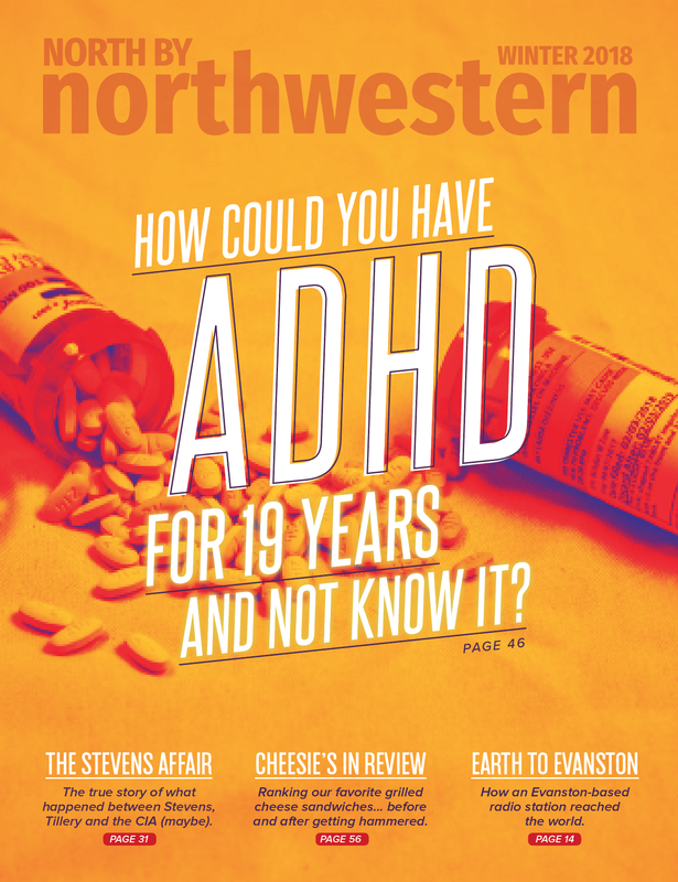
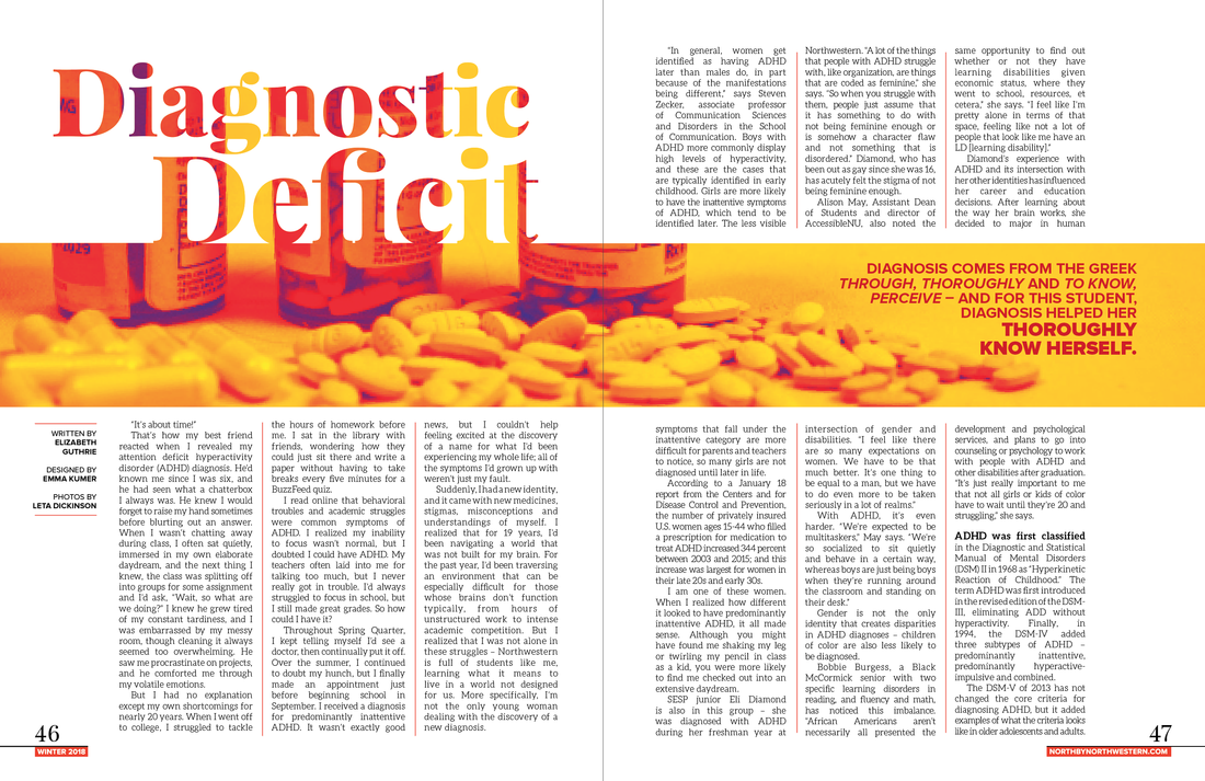
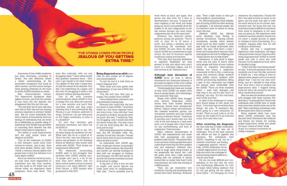
ADHD Feature
For this story, the only images we shot in the studio included pill bottles and detached hands holding fidget spinners. This proved to be a challenge, since the unedited images were fairly boring. However, I used Photoshop color mapping to transform the shots into pop-art style images. I wanted to use high saturation and dramatic colors to make the story high-energy and colorful, bringing the tone into a lighter and more positive realm.
Flowcharts & Quizzes
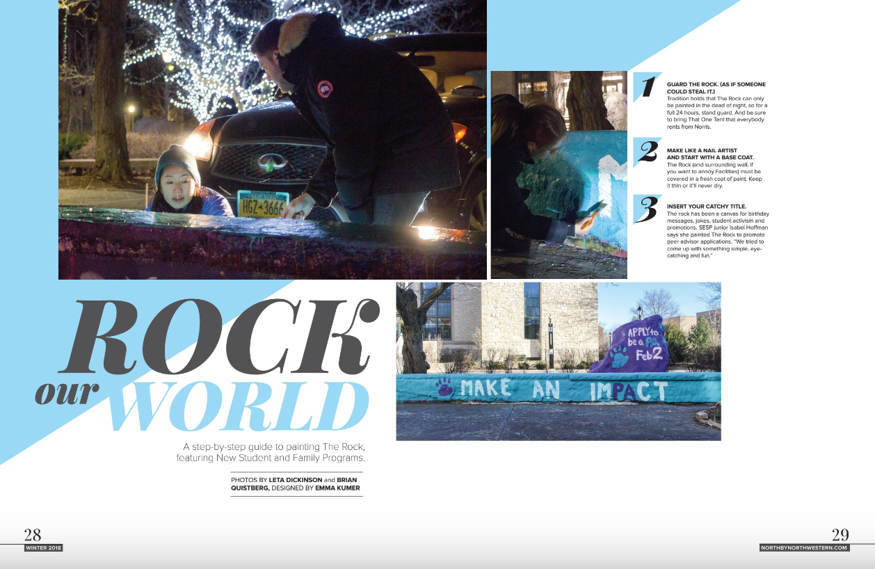
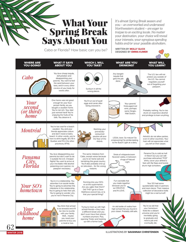
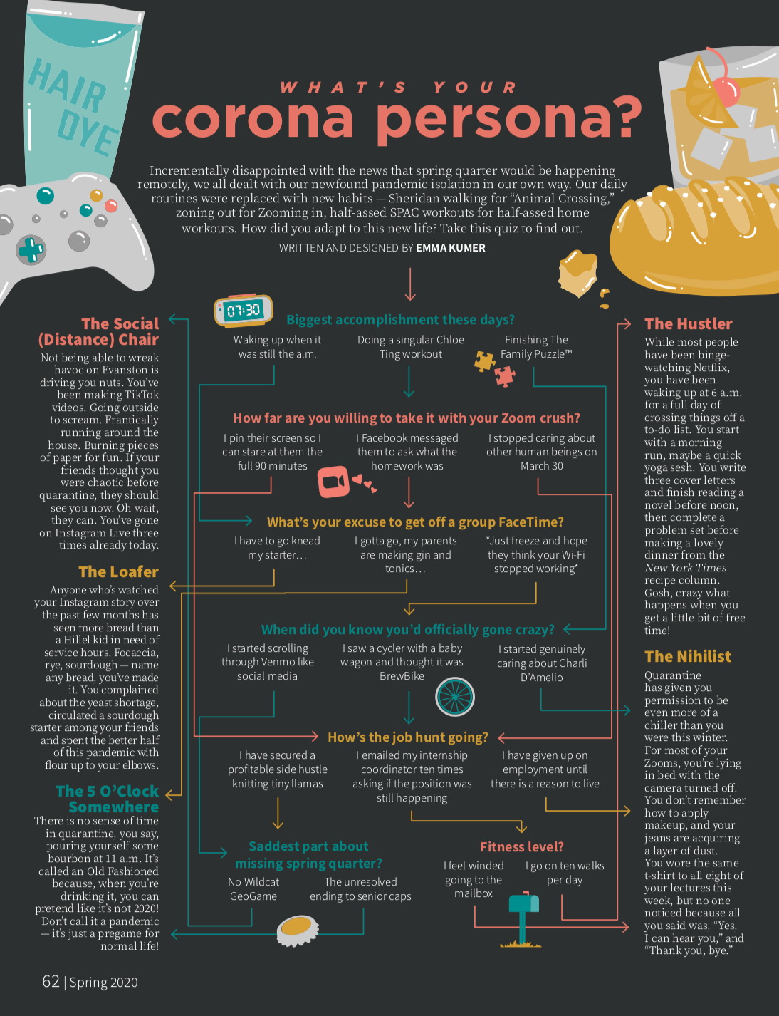
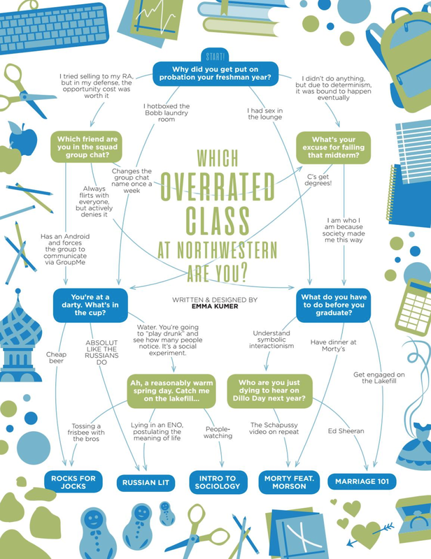
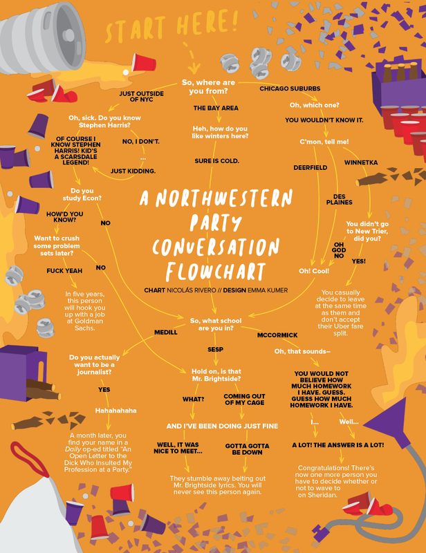
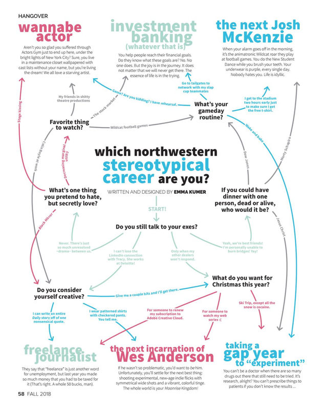
I will always have a soft spot for a good old-fashioned magazine quiz. The goal of these layouts was to make them visually-appealing, interesting, easy-to-follow, and overwhelmingly fun. Click each to enlarge.
Miscellaneous Fun Pages
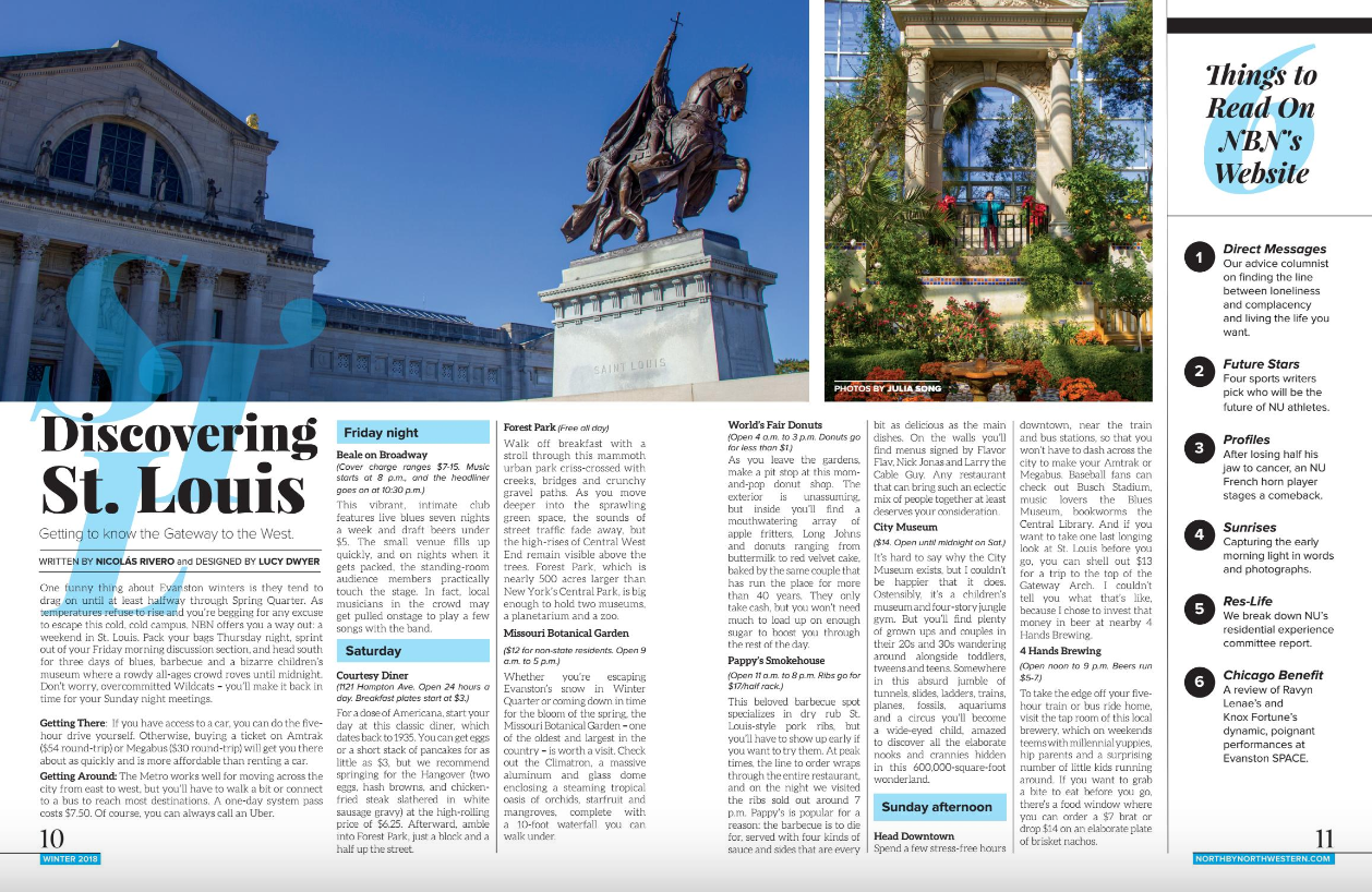
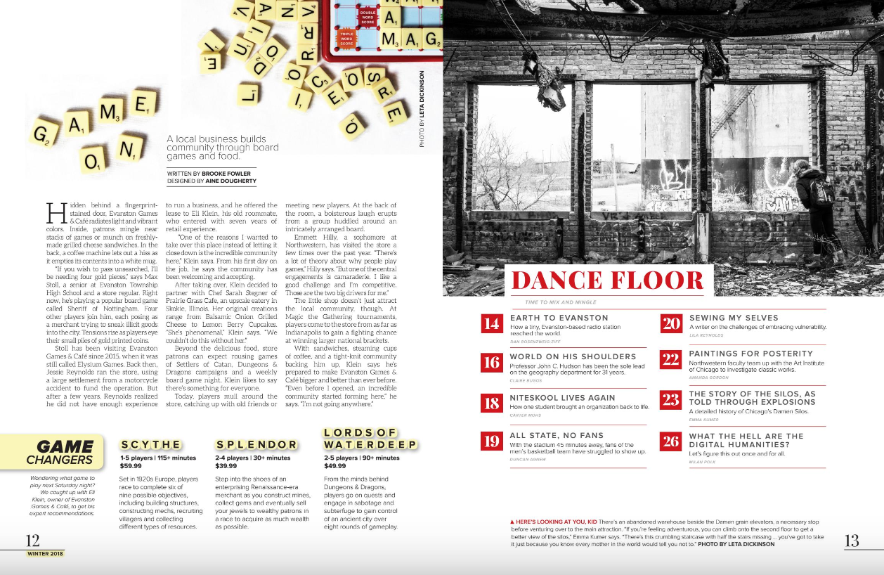
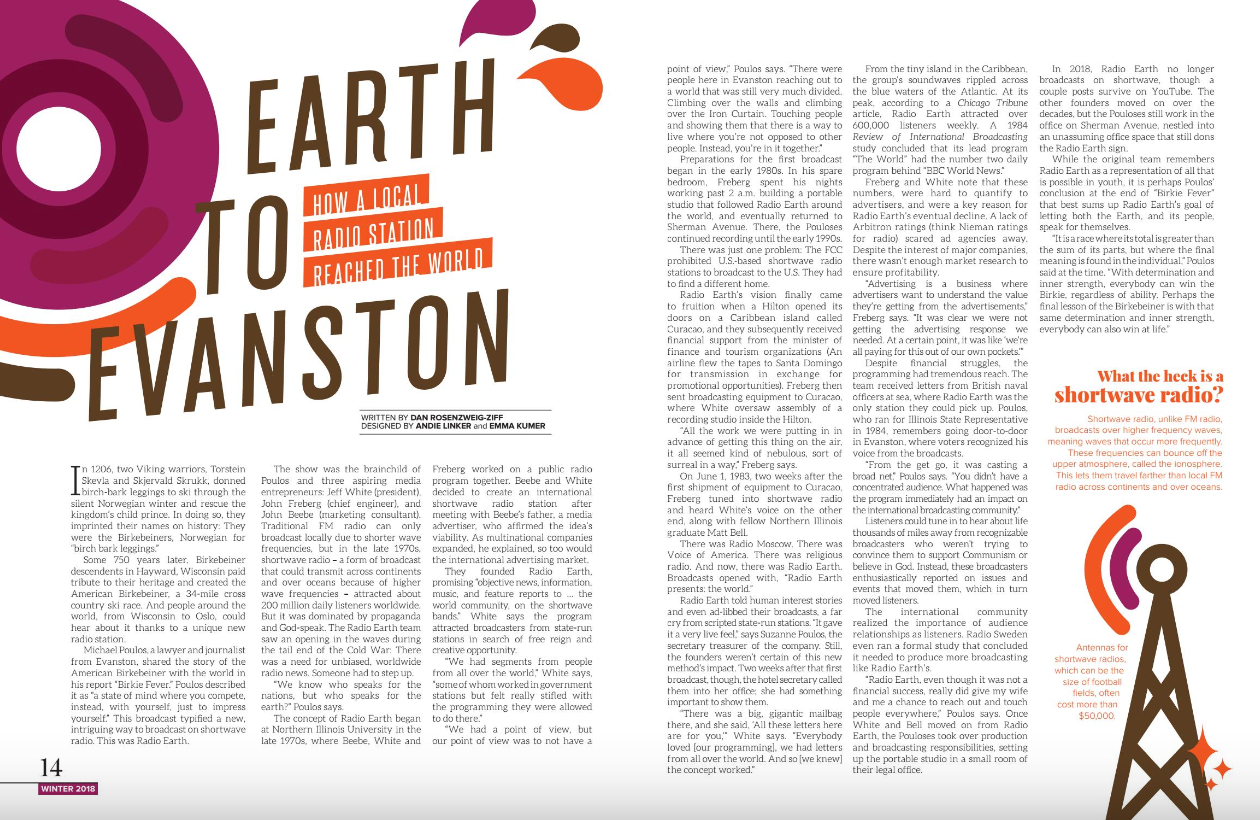
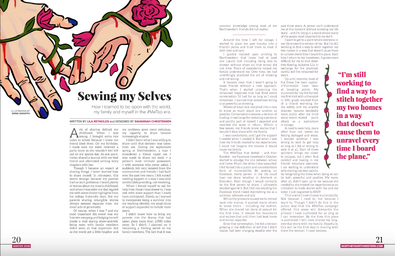
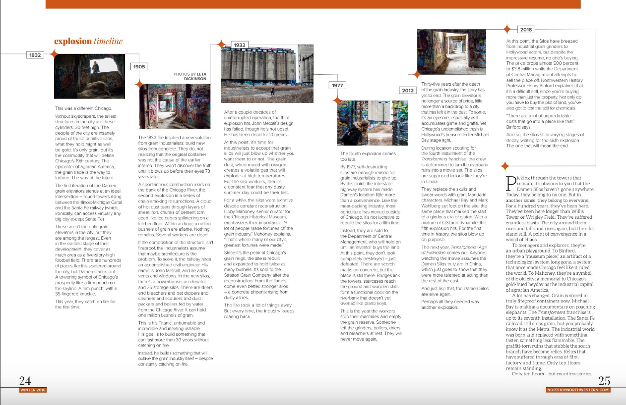
While the long-form features and back-of-the-book quizzes are my specialty, I've designed my fair share of other pages for NBN too. While the fonts and color palette change from issue to issue, it is always my goal to reflect a story's energy and theme through the aesthetic of the design.
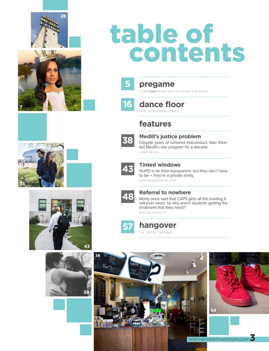
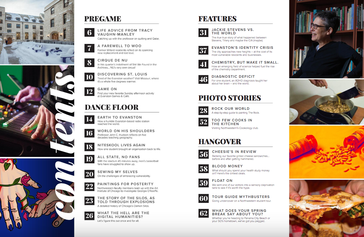
Table of Contents
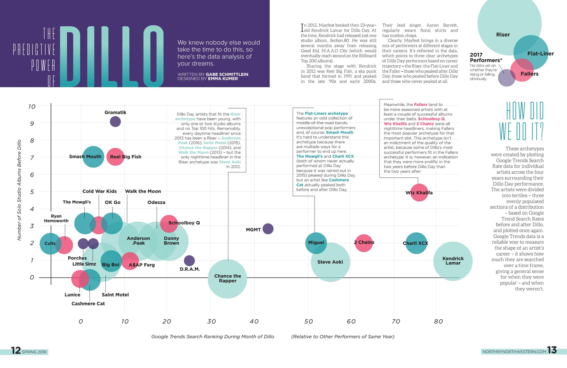
The Predictive Power of Dillo (Data Viz)
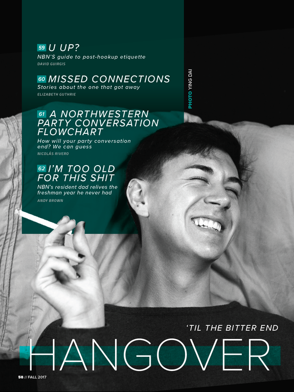
Divider Page
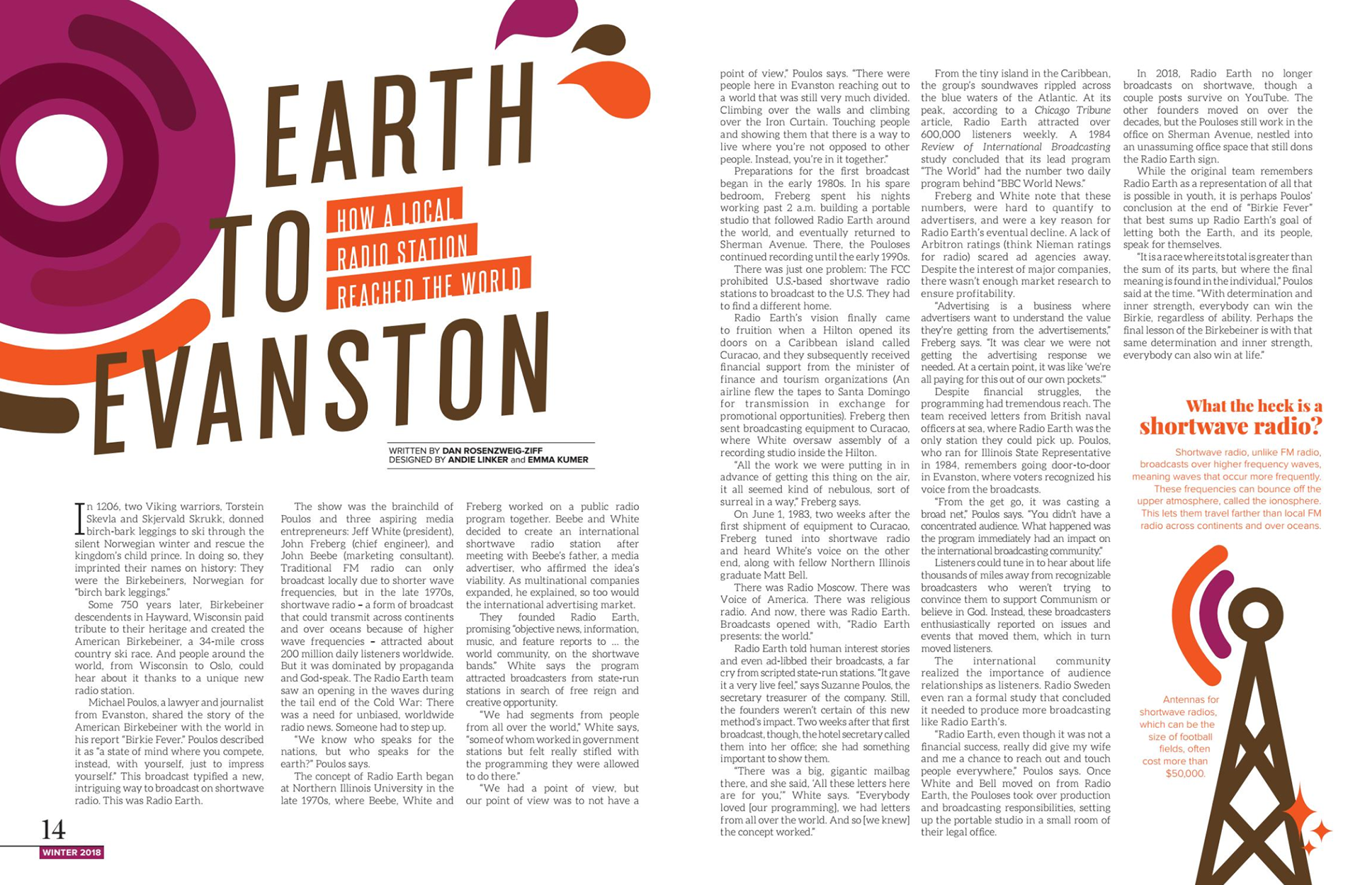
Shortwave Radio story
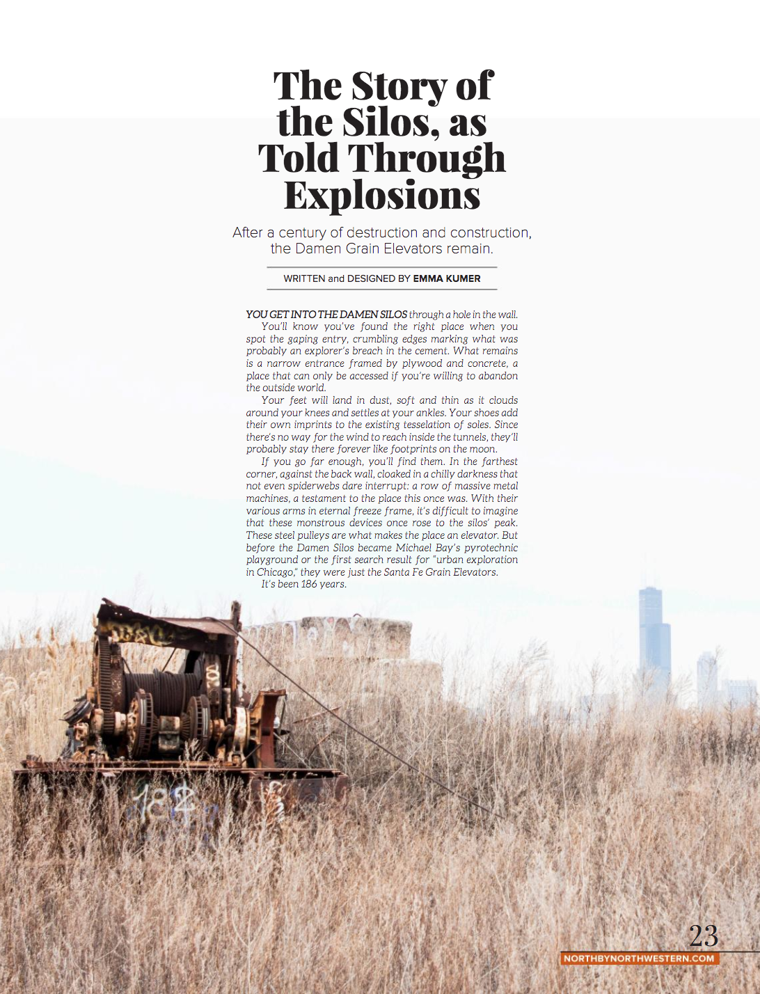
Feature Intro
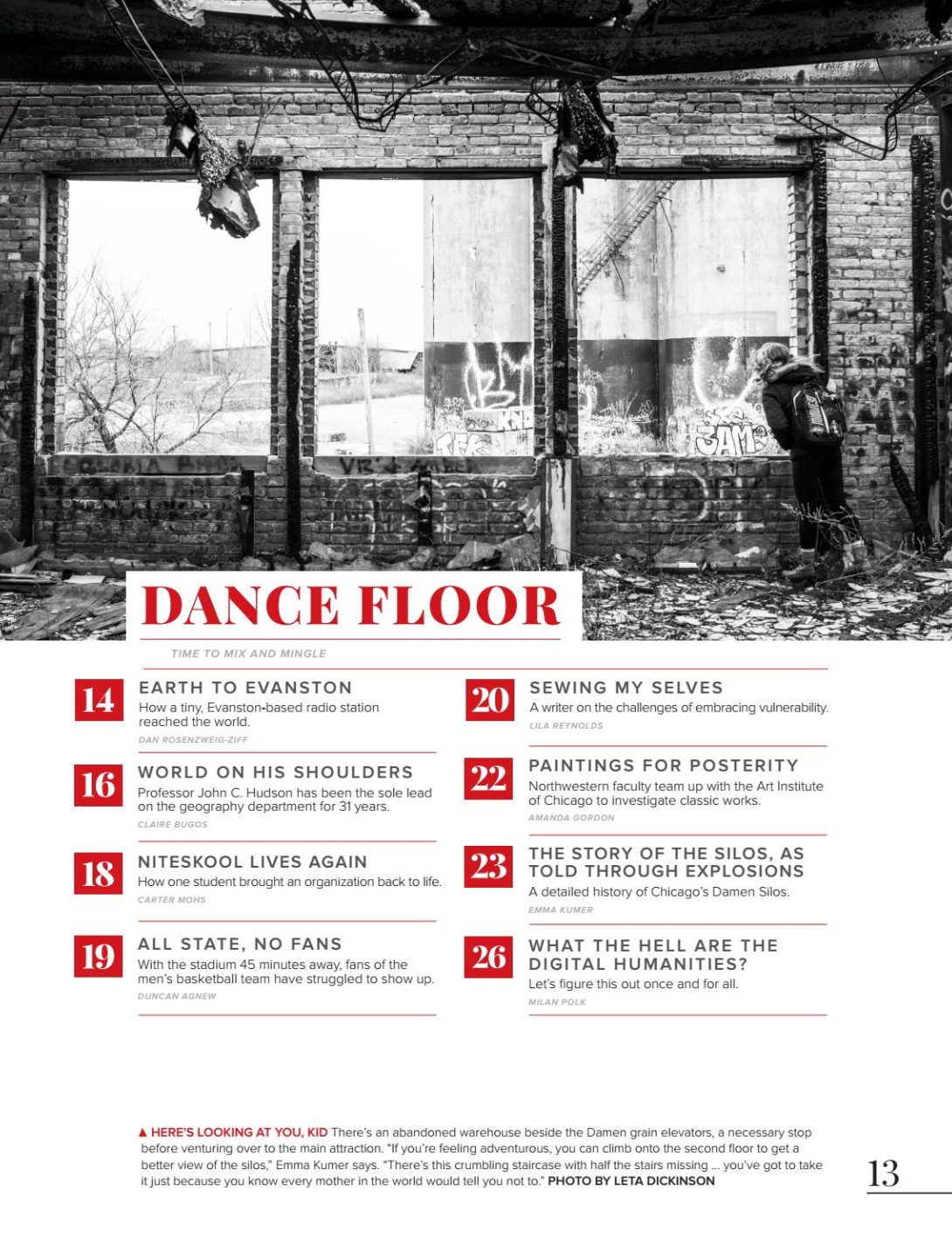
Divider Page
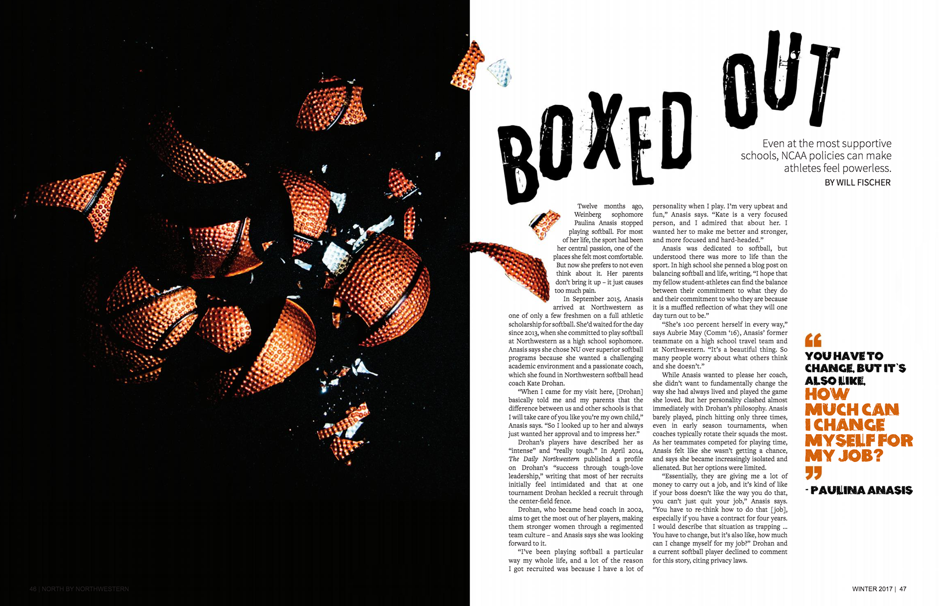
My first ever feature, still one of my favorites
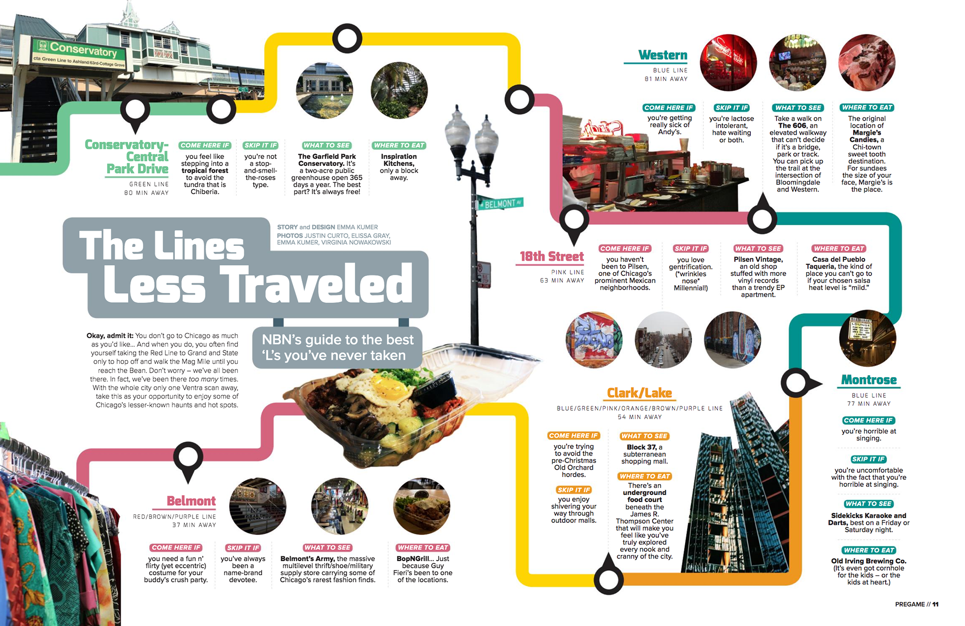
Adventures on the L
Creative Direction & Leadership
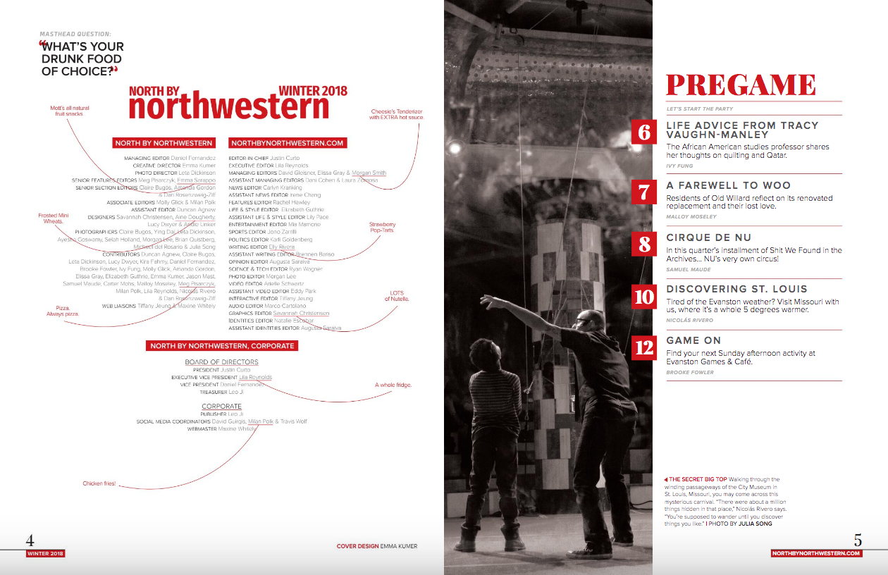
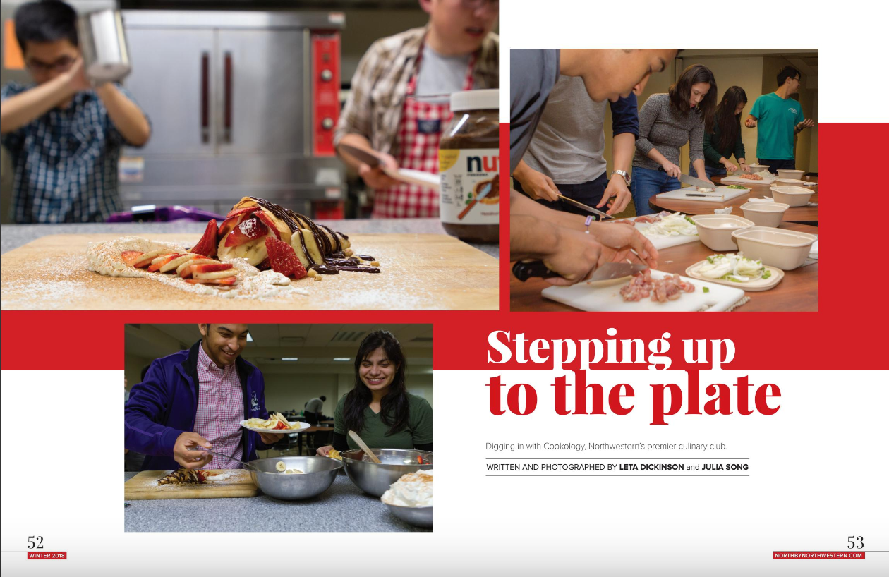
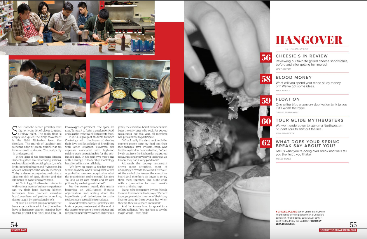
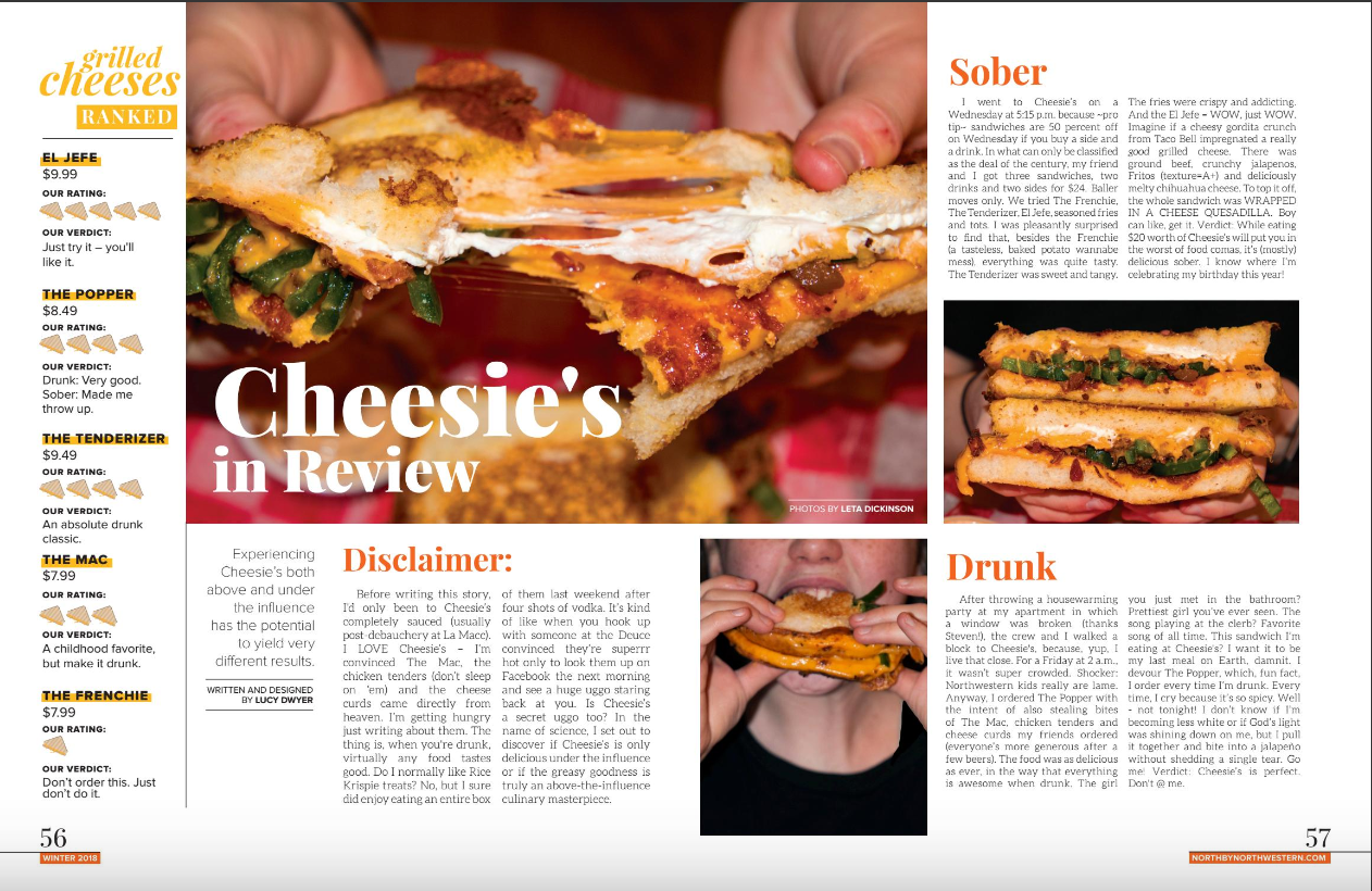
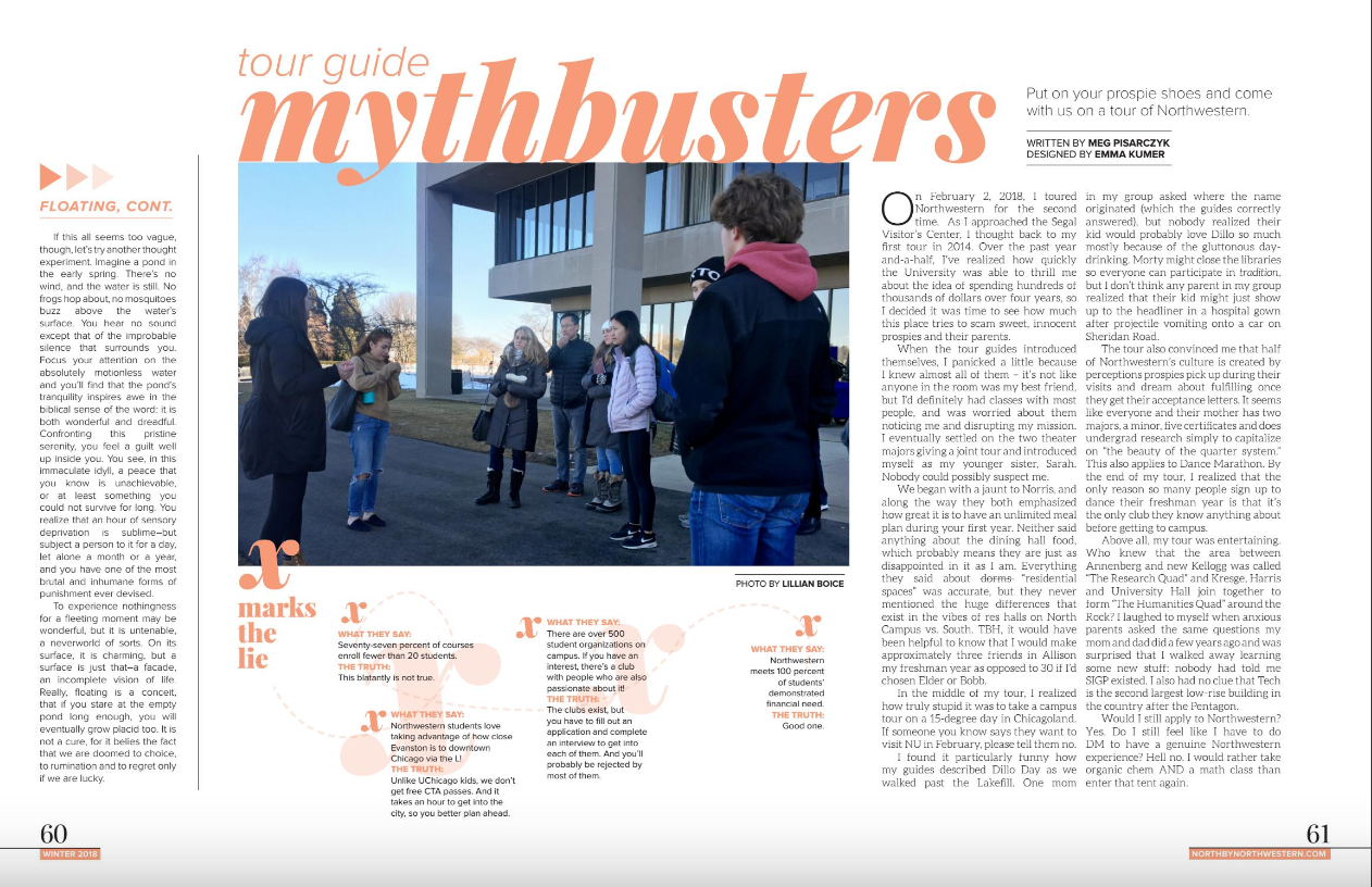
As Creative Director, I worked on establishing a style guide and keeping a consistent visual identity. With a staff that changes every three months, having a uniform look and feel was a way to keep the magazine brand recognizable. It was important for me to keep section titles, typefaces, and general organization constant. The Winter 2018 issue is my favorite of the magazines I've directed; every page feels unique and different, but you can look at any spread and immediately identify that it is from this specific issue.
